Easier health monitoring for clinicians with a wellness score tool

Mar 2022 - May 2022
Product design | UX research |Health tech
About ConnectedLife Health (CLH)
CLH Dashboard is a healthcare platform designed to help clinicians monitor patient health. In 2022, CLH began developing a tool to calculate health span, enabling clinicians to guide lifestyle decisions.
Role
I collaborated closely with the PM, stakeholders, engineers and scientific officer.By understanding clinicians’ working behaviours, preferences, and workflows, I designed a solution that help the clinicians to easily understand the patients' health status.
Results
• 70% The clinicians' satisfaction rate 3 months after the product launch.
• 8% significant increase in revenue in 2021.
• Initiated business setup in collaboration with StarHub in Singapore and secured 2 new business prospects with clients in Spain
0 / BIG PROBLEM

How might we simplify the way clinicians view and monitor patients' health conditions?

1 / CONTEXT

In early 2022, Apollo, a CLH client, requested customisable patient data views for doctors

Apollo Hospitals, one of CLH’s clients in Indian, suggested adding a feature that would allow doctors to personalise patient data and care plans, so they could focus only on what’s relevant without having to sift through unnecessary information.
In the previous version of the ConnectedLife doctors dashboard, too much health data made it hard for doctors to quickly find what they needed, as each patient required different information.

I was the solo product designer leading design and research for the Connectedlife products.

This covered everything from the patient platform experience and clinician dashboard to the tools used for managing data.
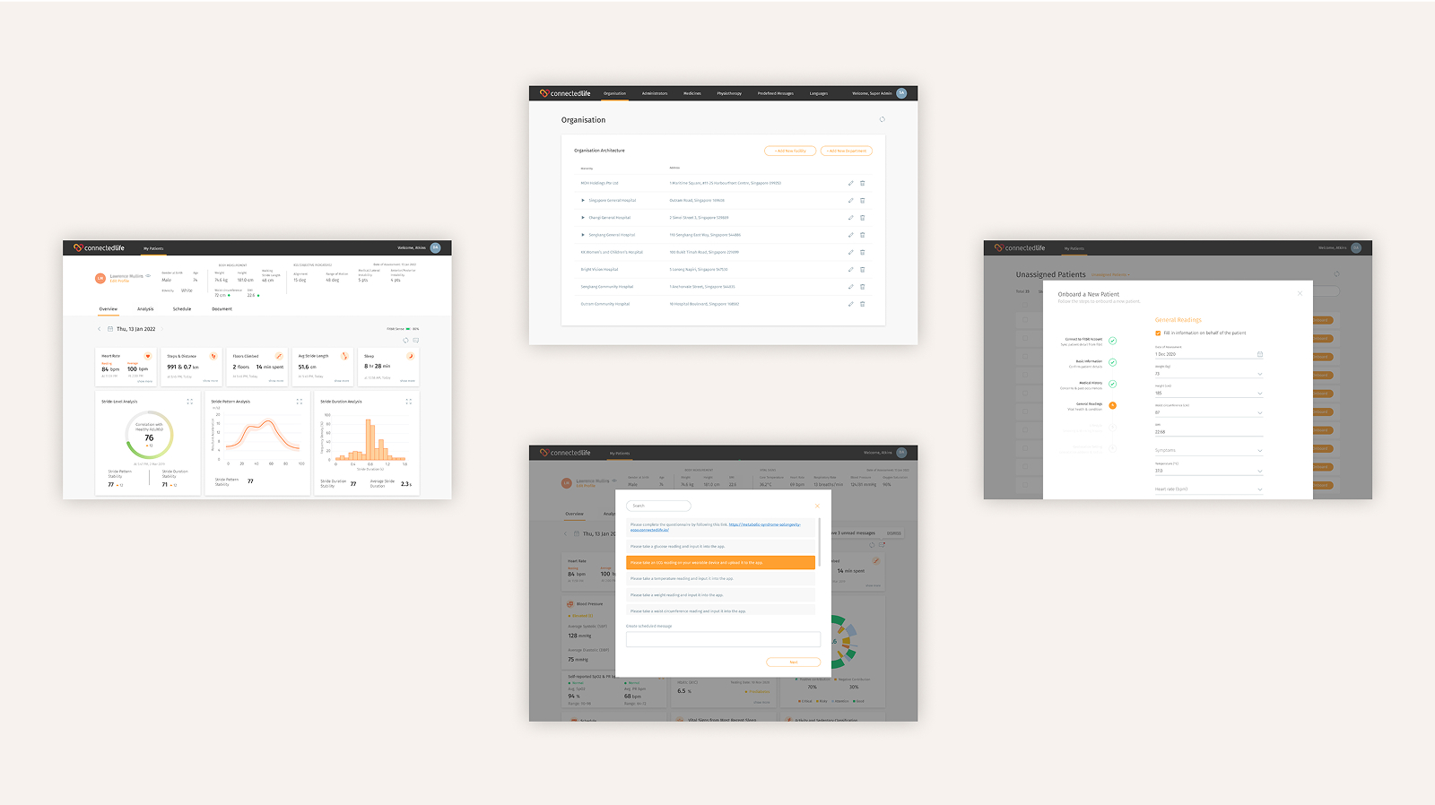
I supported a wide range of product platforms under CLH
2 / EXPLORE

To gain a deep understanding of clinicians' patient-monitoring behaviours, 6X design-focused research studies were conducted

My PM and I collaborated with the marketing and customer support teams to formulate the interview questions and took part in the sessions, which were conducted by the customer support team.
Design-focused research: 6X Deep-dive interviews
Objectives:

• Explore and validate clinicians' needs, pain points, and desired outcomes when monitoring patients
• Identify behavioural patterns and preferences, especially around critical issues
• Gather feedback on the current patient dashboard and uncover areas for improvement

Overall, clinicians want things to be quick and concise.

Clinicians don’t read, they scan.
“ I usually just spend a few seconds scanning each patient’s dashboard — unless I spot something unusual in the numbers, then I’ll dive deeper.”
Time-Pressed User, 52, Male
Not every piece of data is given attention.
“ Just focus on the health indicators that matter for the patient’s condition. The rest isn’t that important.”
Prioritiser, 47, Male
Quick access to key vitals and their trends.
“ Having essential health metrics summarised upfront please. For other data, I can always dive deeper if needed. ”
Selective Detail-Seeker, 58, Male
Insufficient Alert Customization.
“Sometimes the alerts come so often, and many aren’t relevant, that I start ignoring them—and that means I might miss something important.”
Alert-Weary User, 35, Female

We also found a few surprising results during the interview

Data precision is more important than longevity.
Precisely updated data reflecting the patient's immediate health condition is essential for clinician to address any abnormalities promptly.In the other hand, past one-year data is less important because a patient’s condition can change at any time..
Clinicians really love personalisation.
Since each patient’s condition is unique, one-size-fits-all dashboards often fail to support their specific monitoring needs.
3 / DEFINE

Based on the issues we identified, we formulated our main problem statement.

How might we simplify the way clinicians view and monitor patients' health conditions?

At the same time, we defined the scope of health indicators through a card-sorting exercise, and I designed the icons for them.

We conducted a card sorting exercise with clinicians and scientific officers to define and prioritise the key health indicators.
20 health indicators were selected to be included in the wellness score system, categorised into 5 different groups.
Icons I designed for all the indicators.
I created icons to visually represent each health indicator, making the dashboard more intuitive and easy to scan.
4 / DESIGN

Based on user interviews I collected and analysed, I redesigned the user flow to better match real-world needs.

The new user flow I proposed based on user insights

I explored rough ideas to use as discussion points and user research stimulus

The frequency of data updates impact the accuracy of score calculation.
The detail section displays the initial and current values of each health indicator. However, relying on just these two data points can be misleading, as the update frequency for each indicator varies — which may not accurately reflect a patient’s true health progress.

To address this, I initiated discussions with clinicians and the Chief Scientific Officer to review each health indicator individually and define appropriate value ranges.
One of the scenarios we tested
The chief scientific officer and I collaborated to discuss the overall user flow and UI design direction.
I worked closely with the chief scientific officer to shape the overall user experience. Together, we mapped out the key steps users would take in the product, and discussed how the interface should look and function.
A sample of consolidated session notes consolidated in an Excel format.
5 / DELIVER

Final solution

The wellness score and latest data display the patients' health status
The doughnut chart contains all the health indicators have inputed. Each ring represents a health indicator. The patient’s expected health span score shows in the middle.
Graphs for each indicator illustrating the trend in the patient's condition
Visualise the data for up to three months to depict the trend of the health condition, aiding clinicians in making informed decisions with minimal time and effort.
Wellness targets that are adjustable for each patient
The clinician could adjust the value based on the patient's health condition.
The change in target will be reflected on both the clinician's dashboard and the patient's app.

Results

Achieved notable improvements in clinician satisfaction and drove significant revenue growth in 2021.The success of this new flagship feature also led to a business setup collaboration with StarHub in Singapore and opened doors to two new business opportunities with clients in Spain.
Clinicians’ satisfaction rate
after the product launch
80%
Revenue
in 2021 increase in
58%
new business prospects
Singapore and Spain
3
Articles highlighting the business alliance between StarHub and ConnectedLife.
6 / AFTER THE PROJECT

Things I wish I did better

Handled Big Projects More Strategically
Looking back, I realised I often jumped straight into execution without fully aligning with all stakeholders or anticipating long-term challenges. With more strategic planning upfront, eg. setting clearer goals, mapping dependencies, and proactively managing risks, I could’ve driven smoother outcomes and less last-minute firefighting.
Presenting designs in earlier stage
I used to wait until my designs felt “polished” before sharing them, thinking it would make a stronger impression. But I’ve learned that early feedback is far more valuable than perfect visuals. If I had presented earlier drafts sooner, I could’ve uncovered misalignments earlier and saved time on rework. Now I see design as a conversation, not a reveal.
BACK TO TOP ↑
SPH Digital Magazine Shopping Journey
Samsung Checkout Flow
CLH Wellness Score
ambertongsg@gmail.com
©Amber Tong 2025