1 / CONTEXT
Her World introduced affiliate shoppable content as a strategic vertical to drive revenue growth.
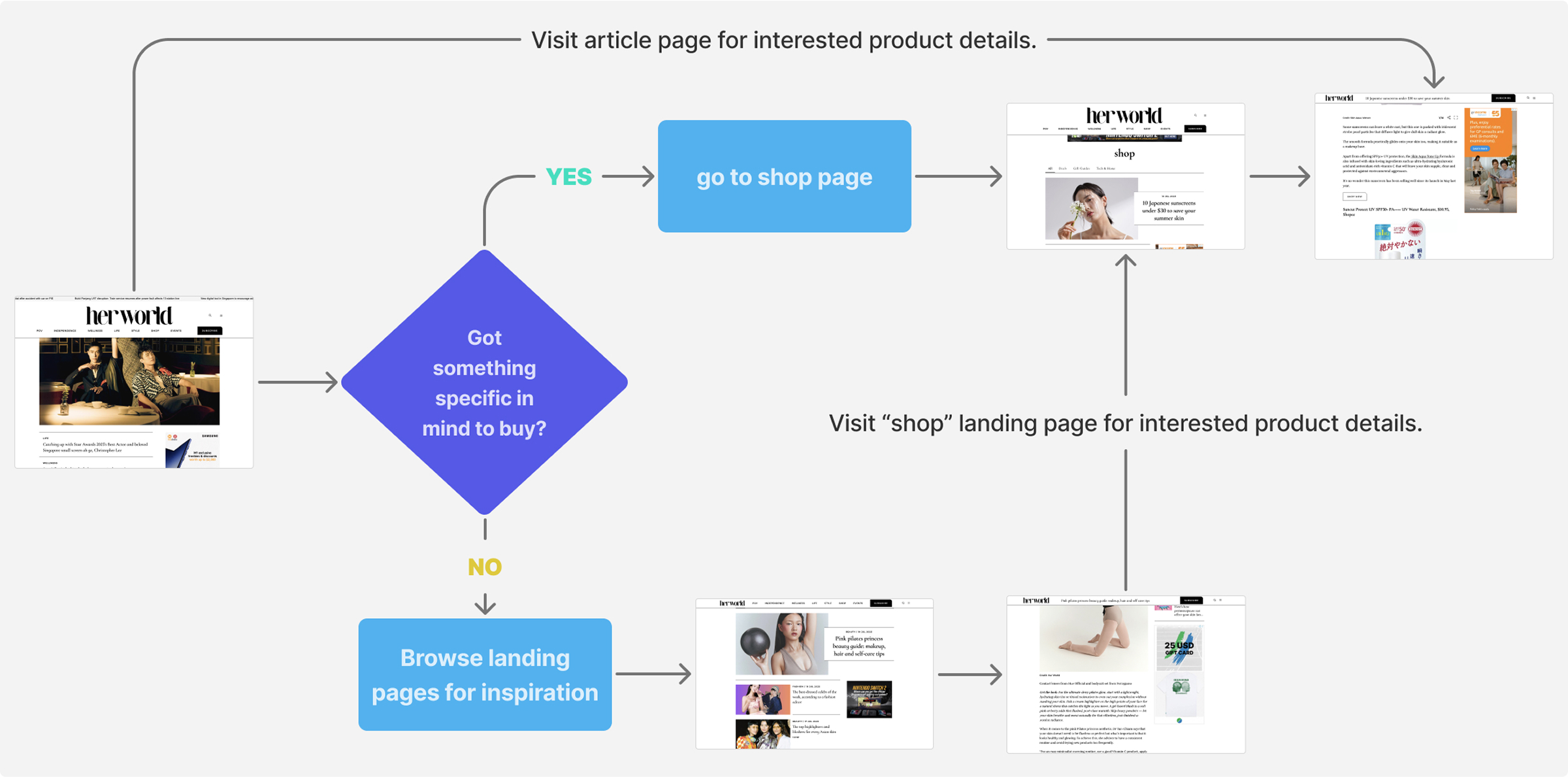
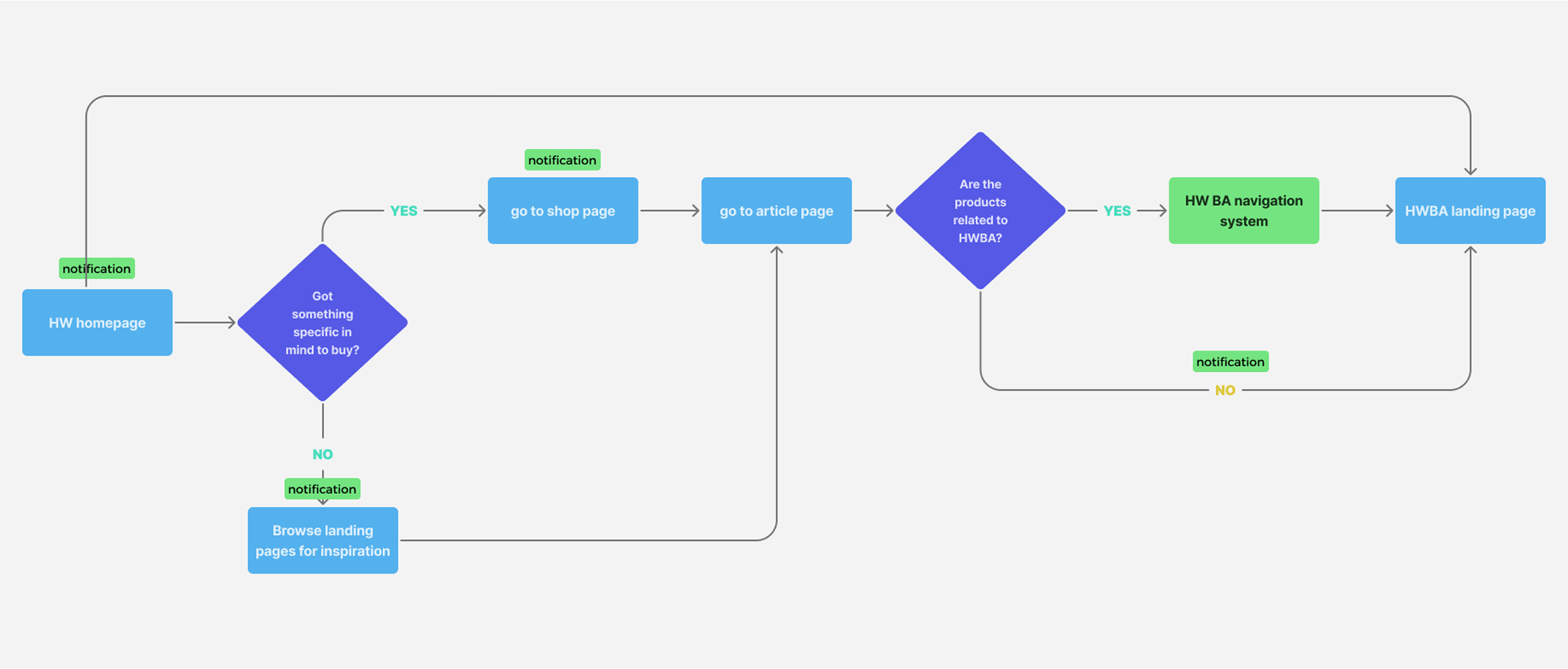
The business goal is to drive more shopping behavior on Her World by boosting click-through conversions.
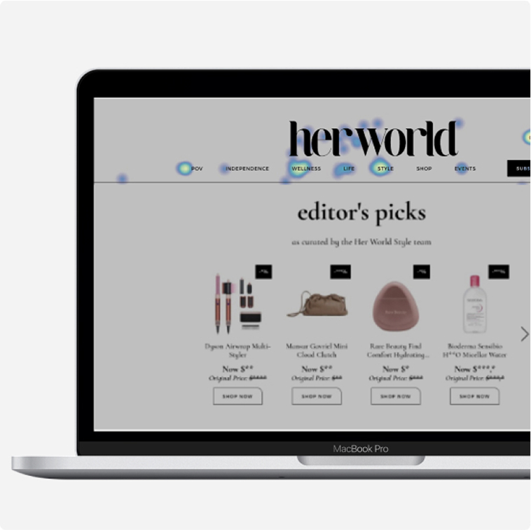
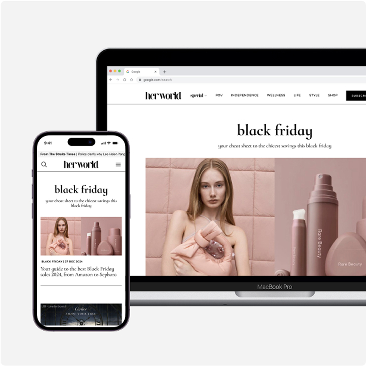
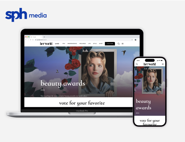
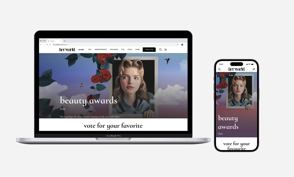
Screenshot of Herworld’s Latest Digital Focus
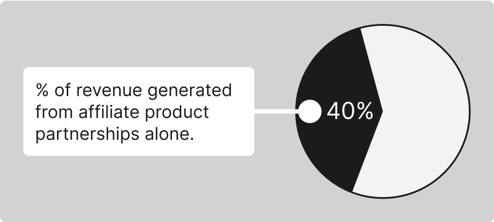
Affiliate marketing contributed 40% to our overall performance volume.
If we can promote these products more efficiently and improve their corresponding user conversion rates, it will significantly boost our revenue growth.